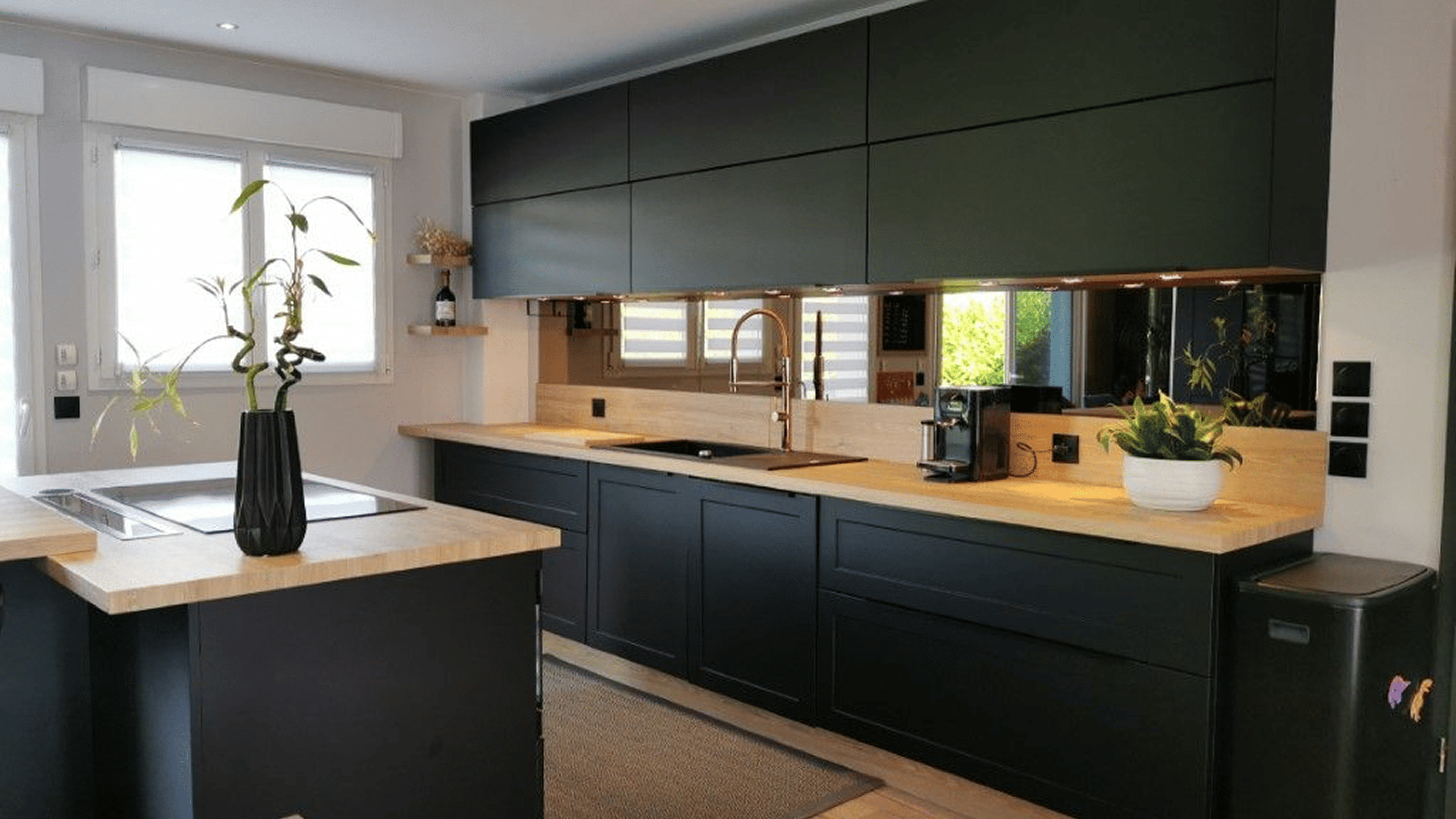
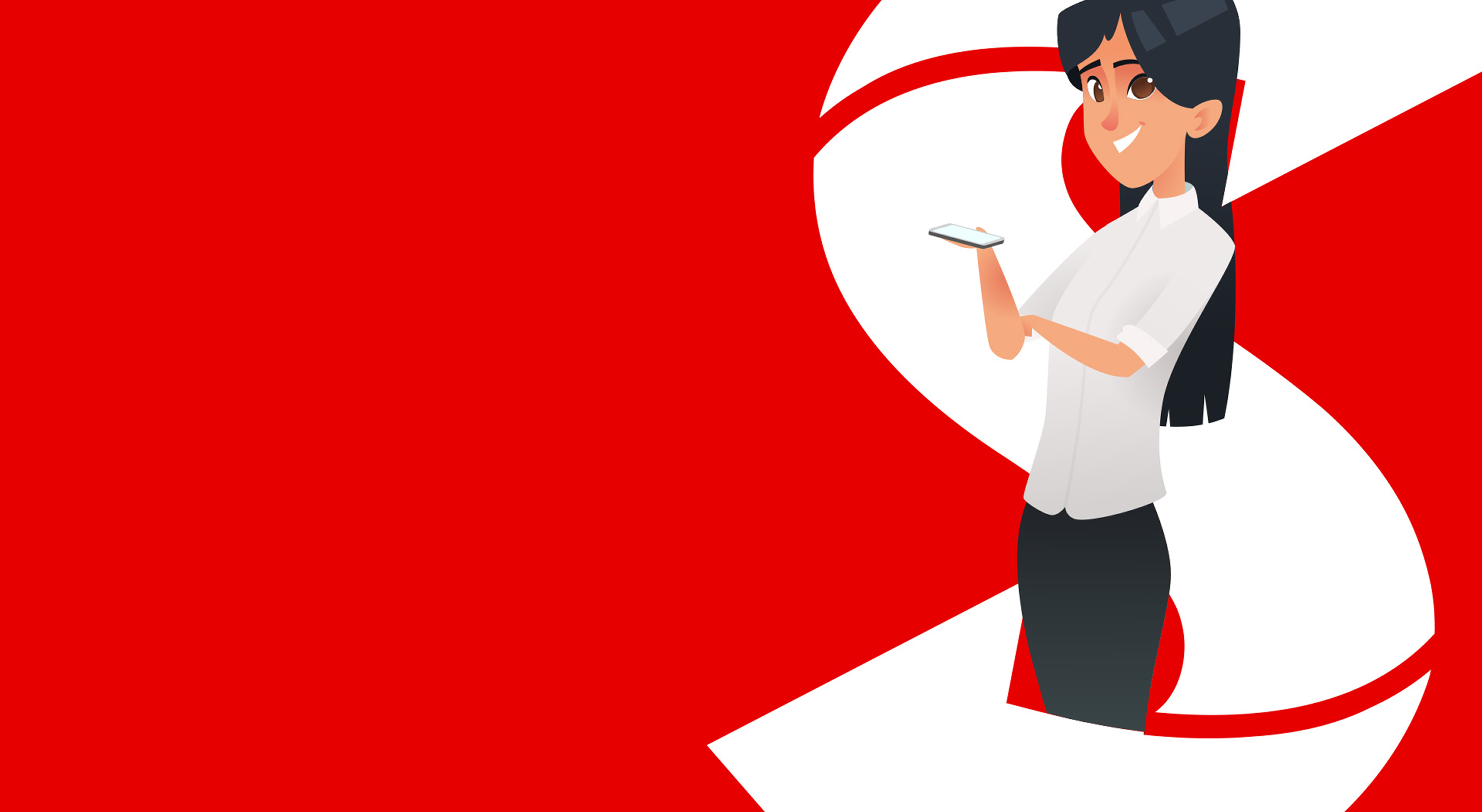
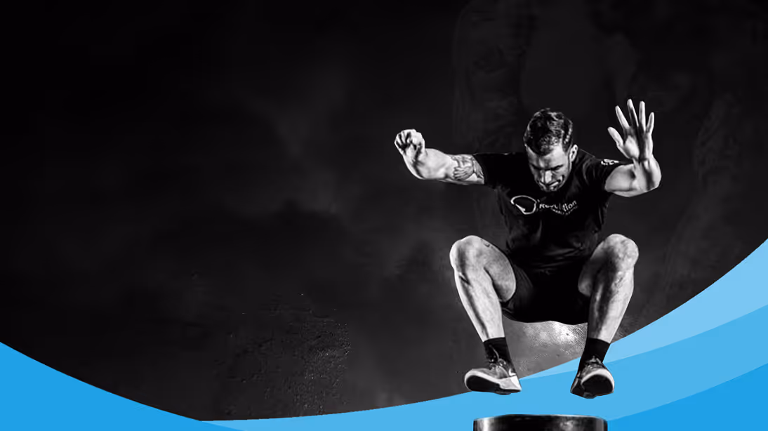
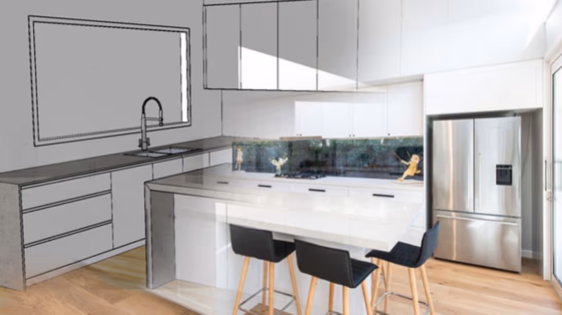
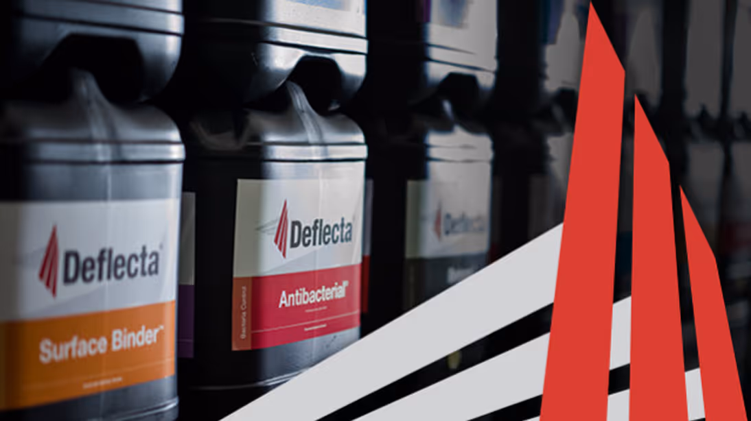


The Crossroads Psychology website was built to make finding support feel simple and approachable. Clean layouts and thoughtful structure guide visitors through services, practitioner information and next steps without feeling overwhelming. Paired with the new brand identity, the site presents the practice as professional, compassionate and easy to engage with.


Alongside the website build, Chilled developed a set of distinctive graphic design elements that reflect the texture, colour and visual character of Vinyl Flakes Australia’s product range. These visuals were carried through the website design to create a cohesive experience, where brand elements, colour treatments and layout work together to reinforce the product offering. The result is a site that feels visually consistent and purposeful, allowing the brand’s unique materials and finishes to stand out while maintaining a clean and professional structure.


The Saver Global website was designed to present the company’s capabilities in a clear and structured way while maintaining a strong, professional visual presence. Clean layouts, purposeful typography and considered use of imagery help guide visitors through the company’s services while reinforcing credibility and experience. The result is a modern website that strengthens Saver Global’s digital presence and supports the business in communicating its expertise to new and existing clients.


Providing customised financial calculators and up-to-the minute fees and exchange rate information was only a small part of helping SaverAsia users get the best results. Understanding the cultural needs and the living situations helped Chilled Creative to refine the SaverAsia website into a Progressive Web App allowing a bi-lingual and mobile-friendly experience that gives SaverAsia the option to manage its content in a similar way to the website. This ensures that both the SaverAsia website and app are always up-to-date, easy to use and helps everyone to get the most from their money.


Revealing the specific functions of specialised products can end in a repetitive list of confusing terminology. For Plega, we created a Product Feature Slider featuring photos of each of the key details to help users better understand the benefits and details of Plega products. Combining clear images with short descriptions eliminates the need for jargon or technical talk.

Plega prides itself on the quality of the products they offer. While they are made for use in medical settings, they are created to suit people’s home and provide support without standing out as a medical device. Our visual team took photographs and video in homely settings to show the way in which Plega can seamlessly integrate into a person’s home and life. Our product brochures feel more like looking through a homewares catalogue to help ease the transition into needing medical aides.


The Vinylize logo was designed around a stylised “V” that reflects the precision and structure involved in high quality interior installation. The angular geometry gives the mark a sense of craftsmanship and technical confidence, while the minimal monochrome treatment keeps the brand clean and modern. The result is a logo that feels professional, recognisable and flexible across digital and physical applications.

The new website was designed to present Vinylize’s services and project work in a clearer and more structured way. Clean layouts, strong typography and generous spacing allow the imagery of completed interiors to lead the experience while supporting content explains the company’s capabilities. The finished site positions Vinylize as a professional interiors partner and provides a stronger platform for attracting new commercial work.


Body text


Deflecta - Concrete Bacteria Control, required a 360 degree refresh of their site which needed to be migrated off the Business Catalyst Platform as well as redesign a new and improved interface. Our team took this opportunity to update the entire design with a clean lined and modern feel that is reflective of the intrinsic nature of their product portfolio.
With this new design we were able to capture more product information and include an interactive colour guide to enable users to see colours applied on various surfaces in real time.
Due to the Deflecta’s business expansion we also ensured translation from English and Chinese for applicable products. This was complemented by a seamless overall user experience and responsiveness.


Our goal for this website redesign was to highlight Seaview Cabinets spectacular portfolio of work, hence Chilled created a platform that didn’t obtrude on the showpieces, rather we created a minimalist vibe that would accentuate the photography.
We helped Seaview re-establish their presence with the right audience, an audience that expects modernity from the company that delivers a modern product. Its brand manifestation is an assertion of proof that Seaview are up with the current trends and qualities. Everything we created for Seaview online extends the perception of their company being elite and dependable.


Koustas + Co is a Melbourne based chartered accounting firm working with clients nationwide and internationally to get results. They have clients in all industries - large and small - in family, private and public enterprise. The team behind Koustas strives for excellence, and employing Chilled Creative to see their website through was a step in the right direction to creating a professional platform that would lift their presence.
By encapsulating Melbourne’s architectural spaces into the website through photography and geometric forms, we created a professional brand with a unique angle. While maintaining the polished and sharp presence that an accounting firm often requires, we succeeded at introducing a visual appeal that would engage prospective clients. With a prominent focus on the people behind the business - Chilled held a photoshoot for individual portraits of the team. Find out some funny and intriguing tid-bits about each member of the Koustas team on their new website now!


SureComm is the preferred supplier of voice and data communication services for consumers and SME’s across Gippsland. Their website refresh and new logo needed to communicate their trustworthy and friendly professionalism, while being confidently and unabashedly Australian.
During the design phase our team generated multiple logo options, including elements that were inspired by their old ‘thumbs up’ design. In the end, it was the combined Australia + Wifi imagery that packed the most power, while being faithful and representative of SureComm’s place as a successful Australian business.

We create dynamic websites that are polished and simple to use. SureComm’s new design exceeded our client’s expectations, vastly improving the site’s functionality while looking clean and fantastic on any device. The refresh demonstrated their brand authentically, with the project finishing on time and on budget. SureComm are now putting their best foot forward digitally, ready to serve their local community for decades to come.


Since the school’s inception in 1975 their logo has paid homage the local flora of the area. The Coastal Banksia, Banksia Integrifolia, is symbolic of regeneration, rebirth and discovery, a fitting symbol for an educational facility. Through a number of iterations the Banksia has retained its place at the centre of the Mount Eliza Secondary College logo and has been incorporated into this latest branding refresh.


Selling a house isn’t an everyday occurrence, and can be confusing, but with Matt Jackson Vendor Advocates they can take away the worry and give end to-to-end support to property sellers. Likewise, marketing can be overwhelming but with Chilled Creative taking you from concept through to delivery you know that you will get the best results for your business.
We took Matt Jackson Vendor Advocates from a brand refresh through to a new easy to follow website with excellent user experience allowing the complex to be easily understood. All parts of the website including the photography, videos, animation and downloadable brochures were created in house providing a seamless and consistent look and feel. Like Matt Jackson Vender Advocates helping your though the business of selling a house Chilled Creative can take your business to the next level with end-to-end marketing support.


Bill from Chilled Creative has worked with Falls Creek Country Club for years and we’re excited to guide them in the next step of their business journey. Our designers gave their dated logo and branding a modern, clean makeover, showcasing the distinctive facade of Falls Creek Country Club. The result was a logo the client could truly own and feel proud of.
Our web team built a highly intelligent website featuring an impressive video hero banner, produced by our video team. The fully integrated RMS booking system creates a smooth user experience for customers on any device and makes taking bookings a breeze for the admin team. Falls Creek Country Club trusted Chilled to create a strong brand for them, and the result is beautiful, functional, recognisable brand identify that delights both the client and their guests.


s a leader in their industry, Ellerslie Australia wanted a website that made a bold yet simple statement – they are the experts in hops, malts and everything brewing. With a broad range of products on offer, the website needed to accommodate large volumes of technical data whilst maintaining an easy user experience and visual space.
Each product page contains a tech data sheet using consistent branding to provide easy recognition and enhance consumer confidence. The tech data sheets have been created in Word allowing updates and edits to be made directly by the client. Future planning for content growth and change is key for all Chilled Creative websites, which is why our websites come with built in content management systems that will provide you the control to grow your website along with your business!
Unique designs, tailored functionality and clever brand integration build consumer trust helping to turn website visits into sales. Visit Ellerslie Australia to see how clever formatting can help communicate heavy information whilst you maintain full control over your website… and have a cold one for us!


Our design for Bourke Air’s new website is all about clarity. Clear user experience and communication of information give potential clients everything they need to know about Bourke Air’s experience and expertise. By championing the priority of the client, which was the communication of pros to clients already familiar with the industry, Chilled was able to generate a slick, professional design that brought digital credibility to this legacy industry player. Clients are quickly assured by the content and user experience of the Bourke Air site that they are dealing with quality installers. The site clearly communicates the successes of a team of dedicated professionals, with a track record of delivering exciting projects for big clients.

Bourke Air’s greatest strength comes from their team of experienced professionals and we’re proud that our design and visuals for their new site champions that strength. The team page, as well as the photography present throughout the site, highlights the whole Bourke Air team, support staff, technicians and upper management. One of the great successes of the site is the clarity it gives clients on who exactly will be handling their installations with expertise and care.


Revolution PT owner, Luke Scott, wanted to help the broadest range of people without working up a sweat. With Chilled Creative as his digital partner, he and the Revo PT staff can focus on being training partners to people around the globe without all the heavy lifting.
A clean, stream-lined and simple interface allows users to find the exercise style that works for them. From being motivated by the Your Revolution podcast, purchasing top-notch training gear or booking in a session, Chilled has made a workout website that works.

“We have been working with Bill from Chilled Creative for close to 7 years now on various projects and I can honestly say that our business wouldn't be in the position it is today without the help and guidance of Bill and his team. We have just completed a new total redesign of our website along with a video campaign and the results since launch have been fantastic. From end to end the process has been amazing.
The team at Chilled Creative has been easy to work with, accommodating for our needs and have managed to communicate with me on my level of understanding at each step throughout the project.
We belong to an extremely competitive, constantly changing industry and through our work with Bill and his team, we have been able to remain competitive with much larger players with bigger marketing budgets and bigger digital footprints. I feel like we are really punching above our weight in the web space.
Online continues to be our number one source of new clientele and with the completion of our newest project I can only see this to continue to outstrip all of our other outreach and marketing initiatives. I cannot recommend these guys highly enough to anyone looking for a digital agency that cares about you as a business and achieving the growth targets that you set.”